Configure widgets
❗ Important: The documentation in this topic refers to a feature or product that is currently in Early Availability status. Features in Early Availability status are only available in production to a limited number of customers based on fit with specific use cases. For more information about Early Availability status, see Product lifecycle phases. If you would like to use the product capabilities described here during the Early Availability phase, contact your AppDirect technical representative.
Once you have successfully connected your data source, you can customize the content and structure of your widget(s). By hovering over your widget and clicking the gear icon at top right, you will notice that there are a number of different menu options. We will cover each of these in detail below.
Edit widget settings
Whether you have made a new connection to one of our integrated web services, or you have connected a custom data source—database, spreadsheet, API push or fetch—the “Edit Widget Settings” menu will now offer new options to modify the data being passed through to your widget (“Data Settings” tab), and the structure of the visualization used to represent this data (“Widget Settings”) tab.
We will explain how you can use the “Edit Widget Settings” menu in more detail below, both for widgets connected to a web service integration and for those pulling in custom data.
Web service integrations
Continuing our Google Analytics example from the Connect your data guide, perhaps you are interested in monitoring the total number of site visitors for the past day rather than the past hour (the default setting). To modify your data accordingly, you’d simply need to select a different option from the “Data Resolution” drop-down. Or perhaps you are interested in representing analytics data from another website that is connected to your Google Analytics account—simply select the connected website from the “Account” drop down.

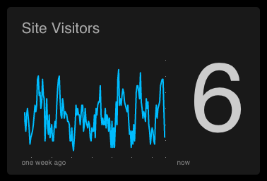
The “Widget Settings” tab will assist you in structuring the visual elements of your widget. Using our example, you could modify the historical timeline of your data—do you want to see your site visitors tracked over the past week? The past month? The past year? Use the “Time Period” drop drown to modify the x-axis to suit your specific needs. Or maybe you want to modify the bounds of your y-axis, change your widget title, or pick a unique color for your sparkline—these can all be accomplished within the widget settings menu.
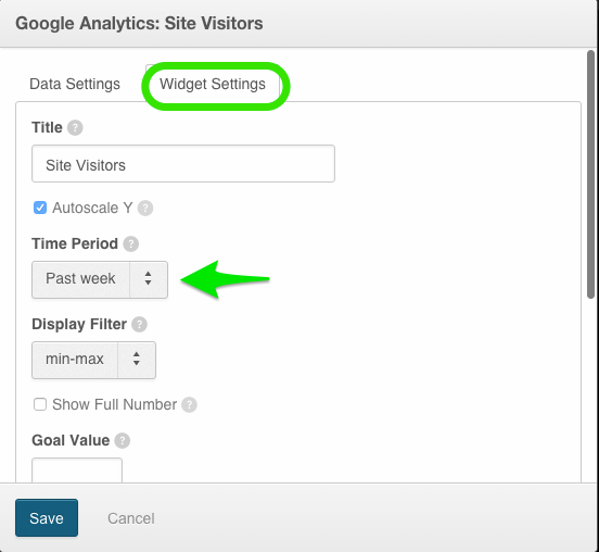
📝 Note: The options presented in our data and widget settings tabs will differ by service, and by visualization. With this in mind, we encourage users to experiment with the various settings that will impact the content and structure of their widgets. If you are having specific issues with the Edit Widget Settings menu that is preventing you from surfacing the metrics that matter most to you, please send a note to our support team.
Once you have made the desired changes to your data and widget settings, click the blue “Save” button to return to your dashboard and view your populated widget. To build a compelling set of dashboards you will follow these steps many times over, combining metrics from various services and sources until your dashboards present a compelling story to your team.
Custom data: Database, spreadsheet, API push or fetch
As our custom data tools retrieve and represent data in an entirely different fashion than our out-of-the-box web service integrations, your options within the data and widget settings tabs will differ slightly. When connecting data from a database, CSV, Google Sheet, or using our API, the AppInsights app will expect that your data has already been processed and formatted to cooperate with the visualization that you have chosen. As a result, the Data Settings tab will present options for connecting your data—i.e. providing your database query, selecting your Google sheet cells—rather than options that will allow you to modify the content of the data itself.
The Widget Settings tab will function very similarly for visualizations that are populated with custom data. Users will have basic options to customize the visual elements of the widget—these will vary depending on the visualization employed. Please note that depending on the format of the data being passed through, the specifications you make within the Widget Settings menu can change the visualization in such a way that might negatively impact the presentation of your data. For instance, uploading one week of data for a line graph using the CSV upload tool and then specifying that you would like your widget time range (x-axis) to cover the last year will yield a graph that is largely empty.
If you have more questions about the best way to represent a certain type of custom data using our available visualization options, please send a ticket to our support team.
Move widget
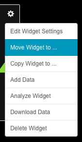
This menu option will allow you to move an existing widget to another dashboard. This move will preserve the widget, the data it contains, all its settings, and it’s data stream identifier.
Copy widget
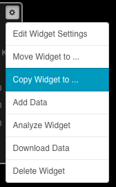
This menu option will allow you to create a copy of your widget, either on the current dashboard or on another dashboard of your choosing (space permitting). Please note that your widget copy will maintain the same settings and data, but will carry a new widget identifier for Advanced styling purposes.
Add data

Any widget with this menu option will allow you to manually enter data into a text window, which will then be instantly surfaced within your widget. Please note that if this is used on a widget that is actively streaming data from one of our service integrations, any incoming data will still be pushed into the widget as normal. This means that in most cases, new data will displace whatever you have manually added. The Add Data option is most commonly leveraged by users of our HTML widgets.
Analyze widget
This menu option is exclusive to users on our 20-dashboard “Engage” plan. Part of our Users and collaboration feature, Analyze Widget will zoom in on your selected widget and allow you to swap between your visualization and the raw data that is used to populate it. Users on your account will also have the ability to add comments to widgets through the menu, which are then viewable in the Collaboration window.
Analyze Widget - expanded widget view
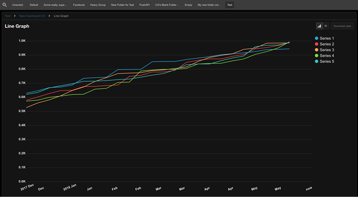
Analyze Widget - raw data view

Download data

This menu option will let you download all the data that is currently contained within your widget to a CSV file. For your convenience, the CSV file will contain your widget’s data stream identifier, and will be formatted for compatibility with our CSV tool: Upload spreadsheet data to widgets.
Delete widget

⛔ Caution: This will delete your widget permanently, along with any data contained within. Once selected, a warning will appear. However, once you confirm that you would like to delete your widget, you will not be able to undo the deletion and your data will be permanently lost.
Was this page helpful?
Tell us more…
Help us improve our content. Responses are anonymous.
Thanks
We appreciate your feedback!